Rebranding Project
‹ Return to portfolio
Burma-Shave’s old look was all about nostalgia: your grandfather’s shaving cream. The challenge was to make the brand relevant to young men while keeping the product affordable and appealing to the average American guy.
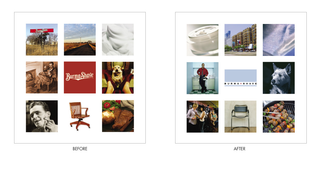
Guiding principles of the old Burma-Shave were convenience, quality, and a down-to-earth, friendly accessibility. The new brand had to embrace the skincare needs of a younger market while retaining those core principles.
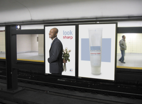
I capitalized on the old Burma-Shave road signs, still the most-remembered aspect of the brand, with a few ads designed to be viewed serially.


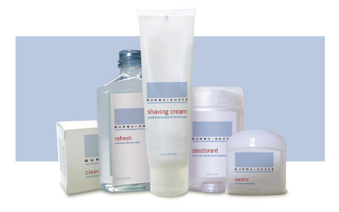
Packaging echoes the basic brand statement of simplicity and style within reach. Products are designed to stand out on the shelves, where the majority of men’s skincare lines have heavy, saturated colors. Burma-Shave looks fresh and different.